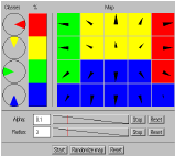
The second demonstration is more complex. A two-dimensional map is taught with data from four classes. As the result the classes will occupy separate areas on the map. Classes and their proportions as well as other parameters may be set by the user, and this allows wide range of experiments.
 The four 'pies' shown on the left define the input data
classes. The pies generate two-dimensional vectors that are uniformly
distributed inside the sector shown in the pie. The relative
proportions of the classes in the teaching data can be controlled with
the widget on the right of the pies.
The four 'pies' shown on the left define the input data
classes. The pies generate two-dimensional vectors that are uniformly
distributed inside the sector shown in the pie. The relative
proportions of the classes in the teaching data can be controlled with
the widget on the right of the pies.On the right is the map. The map units are displayed as arrows pointing to the coordinates in the vector of the unit. When teaching is in progress, the map is redisplayed once a second and the background colors of the map units are set to correspond to the color of the class the vector of the unit is closest to.
Below the map are the control panels to control the alpha (learning rate) and radius parameters. The text field shows the initial value of the parameter. The next indicator shows with the red line where the value of the parameter is at the moment relative to the initial and final values. The actual value is also displayed. Normally the values of the parameters decrease over time when teaching is in progress. The STOP button can be used to stop or to restart the decrease. RESET resets the value of the parameter to the initial value.
Finally in the bottom is the control panel used to start and stop the teaching, randomize the map and reset the parameters.
All widget values can be edited with the mouse. More information about this demo is also available. But now, let us try the demo: